Character first.
Give each business its own typographic voice. Bold can be warm, precise, playful or composed.
The Blunt identity / 5.0 · September 2026
A compact system. One clear voice.
The essentials for making Blunt look and sound like Blunt.
Blunt is an independent design studio building bold, type-led identities for businesses with something to say.
A distinctive name, a clear point of view and a practical identity system that works wherever the business shows up.
Give each business its own typographic voice. Bold can be warm, precise, playful or composed.
Make the offer, the design and the next step easy to understand. Let useful information be useful.
Judge the spacing, letterforms and materials as closely as the overall idea. Finish the system.
 Primary / Ink + Signal on Paper
 Reverse / Paper + Signal on Ink
The supplied SVGs contain outlined paths. Keep their proportions, spacing and full stop intact. Use the black or white version when one colour is needed.
Write Blunt in prose and blunt.design for the domain. Reserve BLUNT. for the visual mark.
Keep at least a quarter of the capital height clear on every side; aim for half wherever space allows. Minimum wordmark width: 96px on screen or 25mm in print. For smaller spaces, use the B. lettermark, at least 24px or 6mm wide.
Use B. for an avatar or favicon where the name is already established. Keep the full name on first introductions.
Square avatar
Optically centred, with built-in space.
Do not stretch, retype, rotate or add effects to the logo. Use a clear background. The full stop stays attached to the wordmark.
Primary type, dark surfaces and rules.
Reading surfaces, space and reversed type.
The full stop, focused emphasis and campaign fields.
Build around Ink and Paper. Give Signal one clear job: a full stop, a useful action or a confident campaign field. Keep portfolio imagery in each project’s own palette.
Use Ink text on Paper or Signal. Use Paper text on Ink. Avoid Paper or white text on Signal. Digital values are sRGB; convert with the printer’s colour profile and proof on the chosen stock.
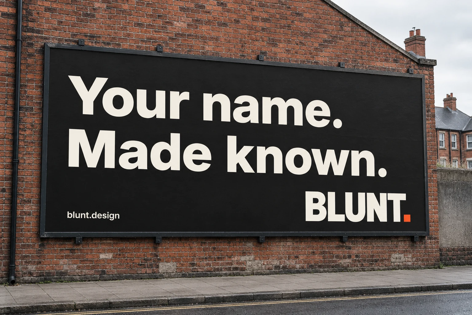
Your name.
Made known.
Sentence case. Short phrases. Confident weight. Use 48–124px on larger screens, with a line-height of 1–1.05. Scale to fit smaller screens and give every line room to breathe.
Bold identities, built around you.
Use Inter 400 for reading and Inter 600 for navigation and practical information. Body copy: 16–20px, 1.5–1.7 line-height, roughly 45–70 characters per line.
01 / Identity, with intent.
Labels and small references: 13–14px, 1.4–1.5 line-height, with natural spacing. Keep functional copy clear and easy to read.
Inter is supplied under the SIL Open Font License. The custom wordmark is separate artwork, supplied as outlined paths. Each client or concept identity gets its own typography.
Align headings, copy and artwork to shared columns. Use a 12-column desktop grid and a simple four-column mobile grid.
Use an 8px base spacing unit. Start at 24px outer margins on mobile and 64px on desktop. Allow 40–80px above a hero and 56–96px below it.
Pair large type with generous space. Use fine rules, sharp corners and a clear hierarchy. Keep motion subtle and respect reduced-motion preferences.
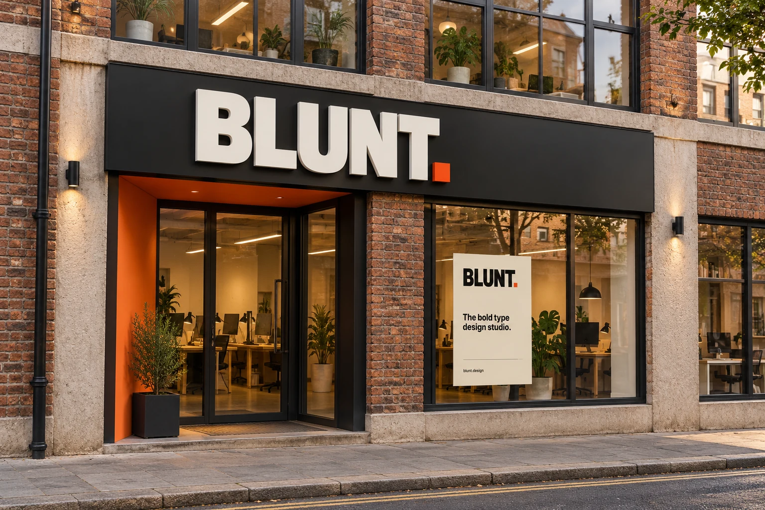
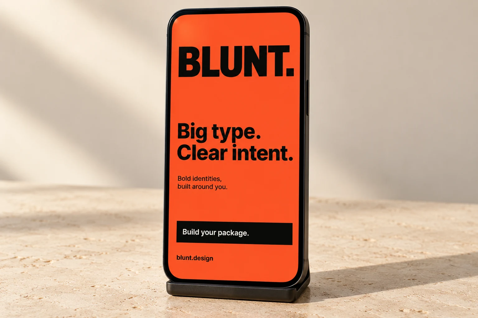
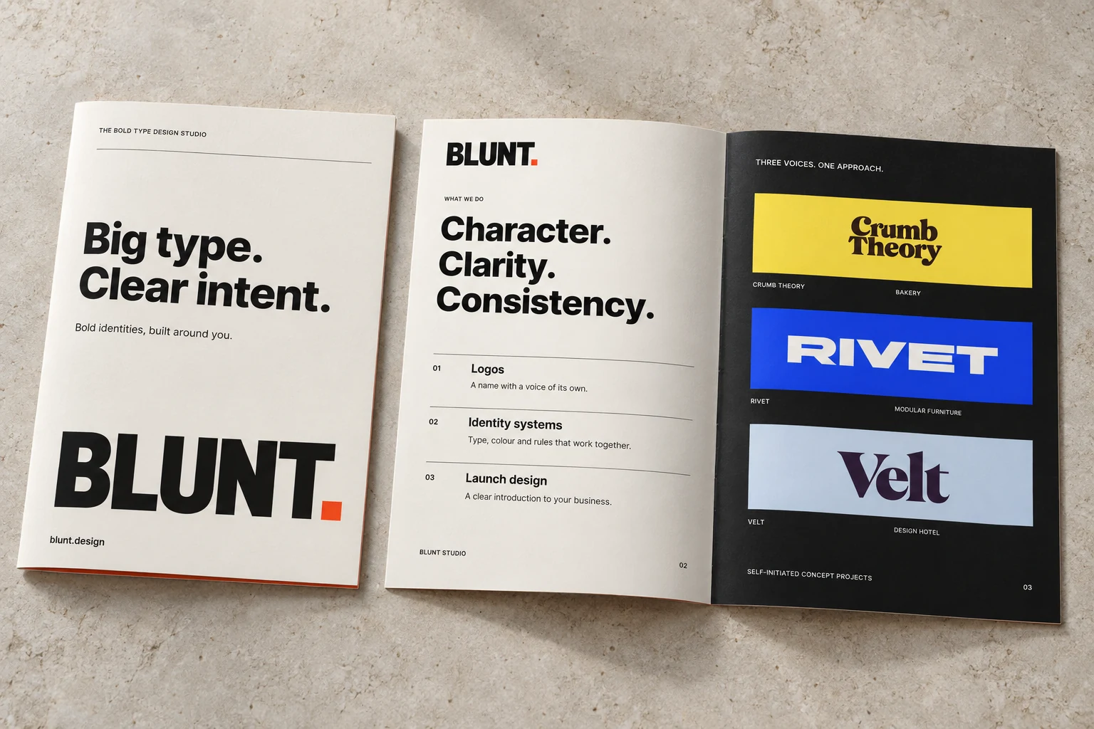
Say what we make and why it matters. Use concrete design decisions to support the point.
Use short, natural sentences, active verbs and UK English. Give one clear next step.
Keep warmth in conversations. Use plain, helpful language in forms, project updates and support.
Bold, type-led brand identities. Logos, brand systems and launch design. Build your package or work with Blunt Studio. blunt.design
Blunt builds identities around the character of a business. We start with the name, give the typography a point of view, and carry that idea into the places people see and use it. Choose defined design services through the catalogue, or work with Blunt Studio on a wider identity, launch or campaign.
“The first direction is ready. We’ve built it around a broad wordmark, a warm palette and a clear packaging system. Take a look through the presentation, then send your feedback in one place.”
Keep promises specific and tied to the agreed scope. Present self-initiated work as concept projects. Use case studies to explain decisions; use verified evidence for results. Avoid inflated claims, jargon and artificial urgency.
The mini kit includes vector wordmarks, B. lettermarks, an avatar, colour tokens, messaging, the Inter font licence, four concept applications, brochure artwork and the PDF guide.
Version 5.0 · September 2026. These are Blunt’s brand assets, supplied for work representing the studio.