01
A recipe with four ingredients.
Flour, water, salt and time. The last ingredient gave this neighbourhood bakery its name and its voice. A recipe card lays out the equation; a stack of soft, heavy serif letters signs the answer.
A self-initiated concept for an imagined bakery.
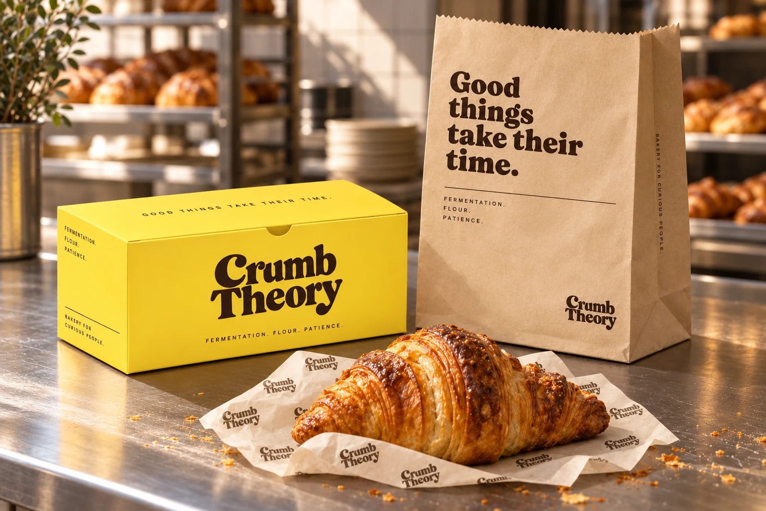
A bakery for curious people. A yellow pastry box puts the name on the counter; a kraft bag takes its message out the door: “Good things take their time.”
Flour, water, salt and time. The last ingredient gave this neighbourhood bakery its name and its voice. A recipe card lays out the equation; a stack of soft, heavy serif letters signs the answer.
The box starts as a flat sheet. The lid artwork sits upside down on the dieline so the message reads from the customer’s side once folded. On the yellow front panel, the stacked wordmark fits between the folds.
The bread bag puts the message first. “Good things take their time.” fills the upper corner, with the wordmark tucked near the foot. One dark ink does both jobs, leaving the colour of the paper to show through.
Good things take their time.
Typographic character
A soft, heavy serif gives the stacked name its shape. The same expressive letters carry the bakery line; smaller, widely spaced text handles the ingredients and production notes.
The dark shapes follow the open holes in a slice of sourdough. Printed against Bakery Yellow, they give the wrap and stickers a recognisable detail of their own.
Bakery Yellow and Crust carry the wordmark. Flour, Icing and Bake extend the palette across recipe cards, seals and packaging studies.
The same stacked wordmark fills a pastry box and fits inside a round profile icon. Its curled letters and long lower line still read at both scales.