Skip to content
All work

Dawson.

A self-initiated brand identity and packaging concept for an imagined preserves maker.

Homemade jam with a distinctive shelf presence. A swash-D wordmark, blackcurrant illustration and a complete label and seal system.

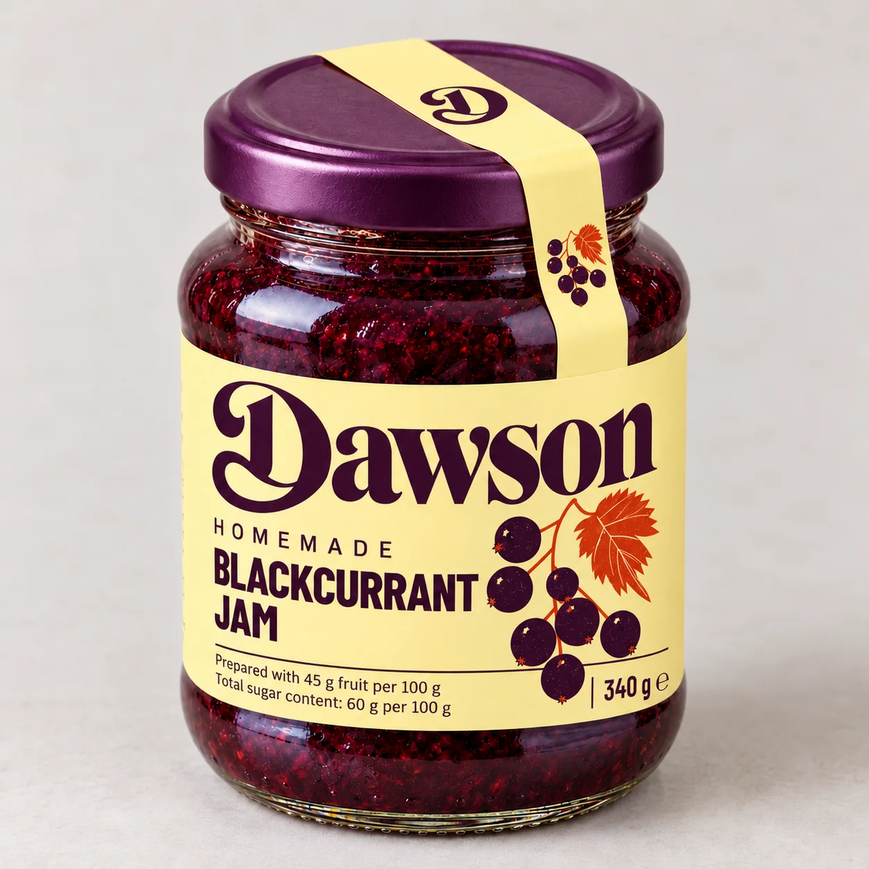
Dawson homemade blackcurrant jam in a glass jar with a butter-yellow label, plum lid and illustrated monogram seal
01

Let the name lead.

A jar of homemade jam, given a recognisable place on the shelf. The large serif wordmark carries the identity; its sweeping D also stands alone on the lid. Condensed supporting type keeps the flavour and product details easy to find.

02

Consider the whole jar.

The front introduces the brand and flavour. Ingredients, nutrition and storage sit in clear panels around the back. A narrow paper seal connects the lid to the label, with the D centred on top and blackcurrants at either end.

03

Colour from the fruit.

Deep plum gives the lettering and berries their colour. Butter yellow adds warmth and contrast, with a vermilion leaf as the accent. The blackcurrant illustration extends from the front label into a repeat pattern and the over-lid seal.

  • Wordmark and D monogram
  • Blackcurrant illustration
  • Colour and typography system
  • Wraparound label layout
  • Over-lid seal design
  • Packaging mockup and artwork studies
All work

Let’s make your mark.